0 Comments
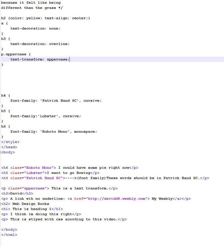  
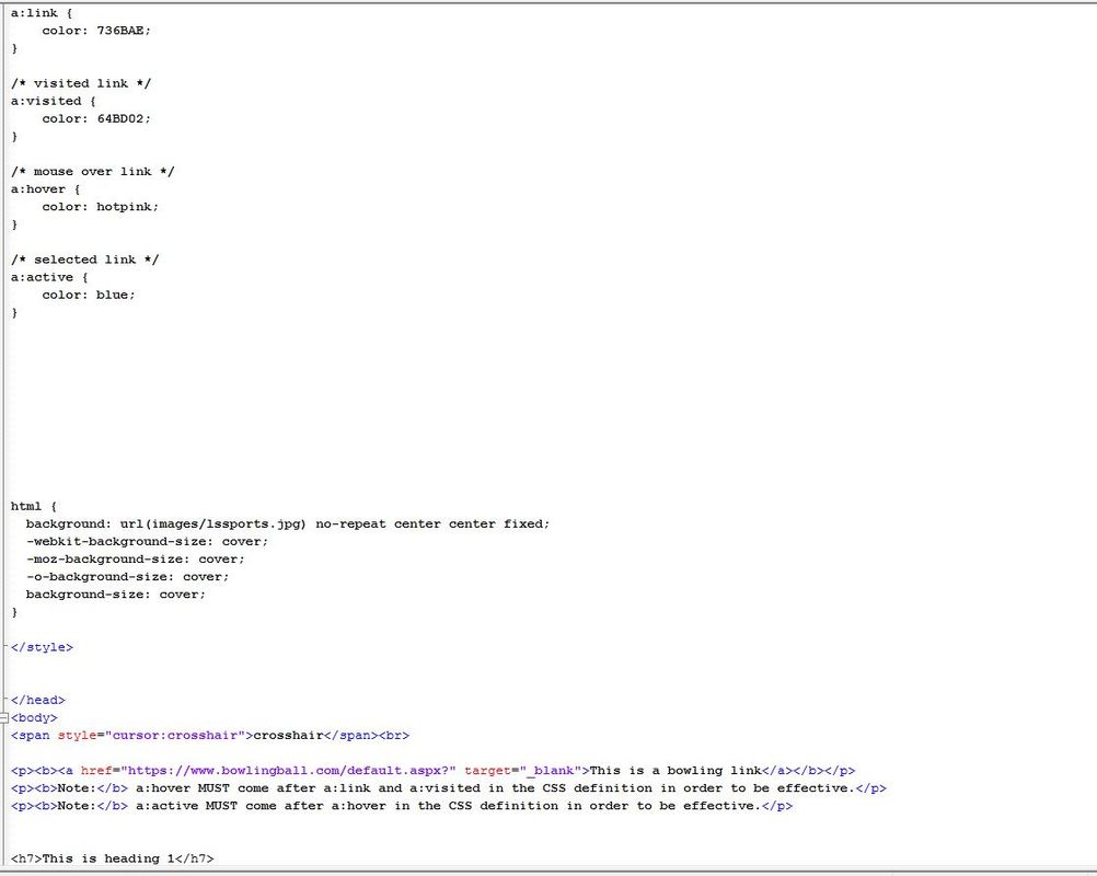
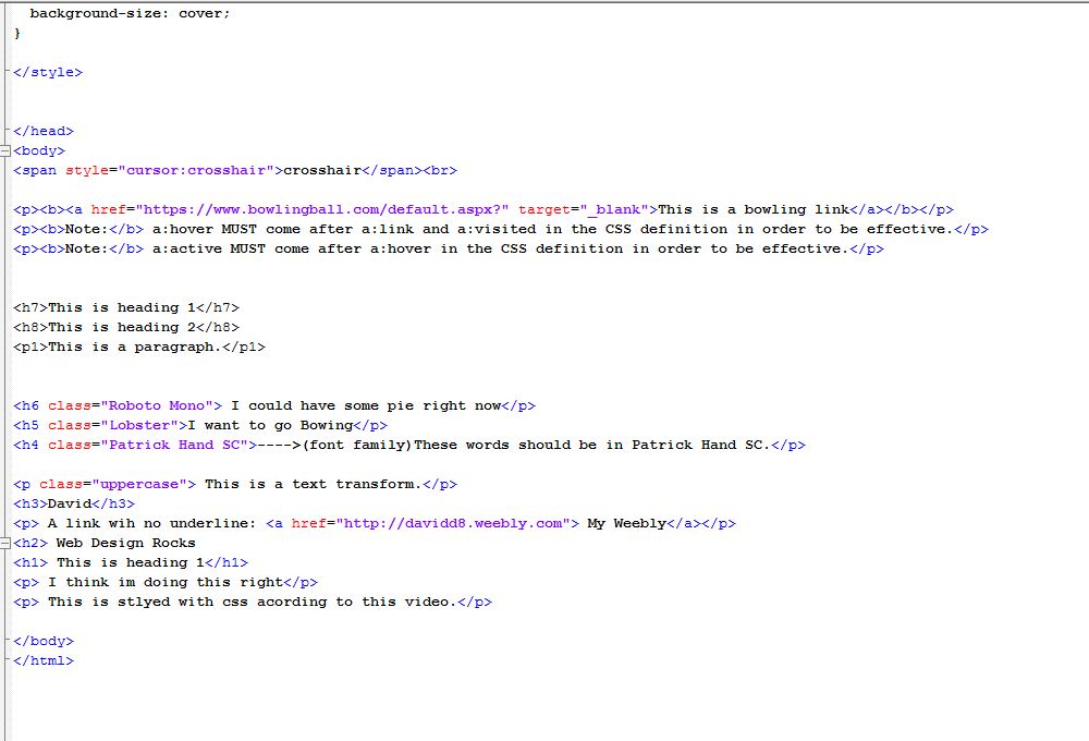
- Internal style sheet ( most used in class) - Inline style
 1. What was the overall biggest issue in everyone's presentations?
A- I felt like i heard a lot of filler words from a big portion of the presenter(" like"," stuff"," everything") 2. Based on peer feedback that others thing i did the best? A- My peers felt i did good with the superpower page. 3.Based on peer feedback what is the one thing i need to work on the most? A- My peers say we should plan our speech better or just talk more fluent. 4. Whether positive or negative, what was the best piece of feedback.? A- Its a tie between the content on our second page, or the spacing joke for page three. 5. Based on presentations over the past two days who do you feel was most prepared,Why? A- I feel Logan was probably the most prepare or at least came across like it ,especially with the nose joke. 6. If you choose a theme for next year, what would it be? A- i think there would be some interesting websites about food. 7. Expand, Why what would you do for the theme. A- The three pages would consist of 1. Favorite dish to make 2. New dish they tried to make 3. overall thoughts on cooking. When working on my essay the tip that i found the most useful was staying positive and not talking about the things that didn't work or the things we didn't have like the pictures in the credits page
In Photoshop today we learned how to use style match, apply a lomo camera effect , fix blemishes, use clone stamp, apply filters, add effects, and use layering style. I felt like I enjoyed using the any of the filet effects tools, mostly the applying filters. I feel most people would agree, because of the fact that I can change a photo or photo layer to any thing, add anything to the layer remove anything from the layer do what ever to it to match my website. I may be able to use this with my website to add a red or green filter of max with a cap or something like that. Cross processing is basically like saturation, and applying a vignette is when you add a darker border every time you clicked the "apply vignette" button. For this photo i used lomo camera effect to be more specific the vignette tool to apply the shadowed border around the picture, and i also used the style match tool to make my photo have the same affect as the ghost town photo.  In this photo i used the vignette and cross processing tool in the lomo effects  In this photo i used the style match tool and the touch up tool to remove some of the leaves in the background.  For this photo i used the vignette tool and the style match tool.
From coding in this class over the two-ish months I have been in this class I feel it has taught me a lot of useful things. First I think the most important thing that this class has taught me that a traditional class hasn't is perseverance and problem solving, and I say this because in code it doesn't always go your way but all you can do is stay calm and find a solution. And that's a lot more than a traditional class has ever taught me how to do. Another thing that this class has taught me that could be useful is CODING its probably a very big aspect of a lot of jobs in 2017, and if i know how to code it opens up a wider span of jobs for me in the future. Also this class has taught how to use Photoshop which is something i have always really wanted to do so thanks.
https://docs.google.com/a/shorian.org/forms/d/e/1FAIpQLSfUV-1gelWjm63RSJPTA8nJdaU3U-bAVo-ZyEhrZL0EnbB5Rg/viewform?usp=sf_link
I feel that the most important part of readability is choosing the right font. The one part i struggle with the most is keeping things like sentences and paragraphs short ,because usually when i type or even write essays i always find myself having the teachers say "no run on sentences please."
In the time I had to construct my index page for my website I learned a lot of new code that was used in this page and probably will be used in the next three pages. My favorite feature in the first page is definitely the logo because I took time to render it and recreate it from paper to Photoshop. For me my least favorite feature for the page is the contrast between the box with the index paragraphs and the background. I feel I could've changed the tone of the text box to a darker shade. If I had to rate the first page I think I would give ourselves an eight or nine out of ten just because we did forget a few things like putting my photo to the left of the page and fixing the spacing in the paragraph itself, or Max actually bringing in a picture of himself for the page. For quality we would give ourselves a four. 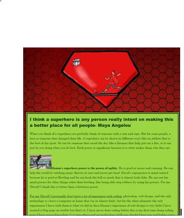 |
